Words That Matter is the collaborative work of eight authors: Leticia Bode, Ceren Budak, Jonathan M. Ladd, Frank Newport, Josh Pasek, Lisa O. Singh, Stuart N. Soroka, and Michael W. Traugott. The authors have expertise in a range of disciplines including public opinion, communications, public policy, and computer science, and they take different approaches to the study of campaign media. As a result, the book is nuanced in its handling of news content, social media posts, and survey responses.
There are a number of reasons that the 2016 presidential campaign was exceptional. The media landscape has changed dramatically in recent years, with many people accessing and sharing news through social media. The authors find that news coverage during the 2016 campaign “was more negative than in recent previous presidential campaigns, consistent with these candidates being the most personally unpopular nominees in polling history.”
Words That Matter guides readers through the media’s process of producing information, how that information gets to voters, and what information voters actually absorb. The authors argue that advances in media technology call for new ways to measure the information environment. They address this challenge through innovative surveys and content-analytic research techniques.
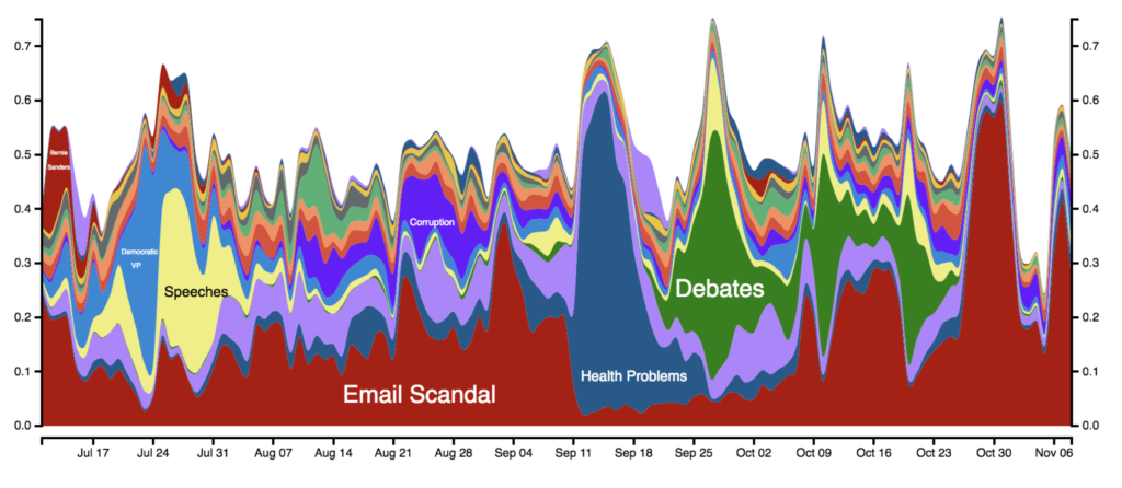
This figure highlights the changing topics that Americans remember about Clinton since July 2016. The x-axis shows the date and the y-axis the fraction of responses that fall into a particular topic.
A key finding of the work is that the largely negative campaign played out differently for the two major party candidates: Donald Trump was confronted with a shifting but largely uninfluential series of scandals, whereas Hillary Clinton faced a single, stable, and influential scandal involving her use of a private email server. The authors show that the long-standing nature of the email scandal made it especially sticky in the public mind. They write “Even when there was other news about Hillary Clinton, the public thought about ‘her emails’—for months and months—indeed, starting before the election campaign was even underway.”
Some scholars are skeptical that the media have the power to influence votes, whereas others believe that campaign messaging can have a large effect. The authors show that not all voters are equally open to influence. The most politically-engaged voters are steadfast, while the least engaged are difficult to reach at all. “The fact that middle- and low-engagement voters are the most susceptible to influence,” write the authors, “also helps us understand why the topics given heavy attention in the media environment can be consequential.”
News stories that are repeated over a long period of time are the most likely to be noticed by people who are not highly engaged with politics. The authors also find that telling people how to vote is less effective than simply changing the subject. Voters who don’t follow the news carefully may not remember the details of various scandals, but they do tend to notice if one specific issue garners sustained coverage. Those sustained scandals stand out as more important when voters make their choice.
The authors conclude that media content can indeedshift voter behavior for some voters, and that in a close election like the 2016 presidential election, these effects can be of real consequence.
A panel of prominent political scientists presented their research at the panel “One Hundred Years of Women Voting: The Nineteenth Amendment’s Legacy and Current Implications” on Monday, February 24, 2020. The experts discussed the political behavior of women leading up to and since the passage of the Nineteenth Amendment to the U.S. Constitution, which granted women the right to vote. Jenna Bednar, professor of political science at the University of Michigan and research faculty at the Center for Political Studies, moderated the discussion. The event was part of the U-M Department of Political Science Rubin Speaker Series and U-M Suffrage 2020 event series.
Mara Ostfeld, Christina Wolbrecht, Angela Ocampo, and Corrine McConnaughy
Popular views of women voters over the past 100 years, and what the evidence actually tells us about them
In her newly-released book, A Century of Votes for Women: American Elections Since Suffrage, Christina Wolbrecht, professor of political science at the University of Notre Dame, presents evidence to challenge some of the long-standing beliefs about the way women vote and engage in politics.
In the first several decades of women’s suffrage in the U.S., understanding of women’s political behavior was based on rhetoric, not based on data, said Wolbrecht. Data does show that married women often voted as their husbands did. Political experts interpreted this correlation as evidence of political disinterest on the part of women, but this conclusion was not based on data. Following the belief that women didn’t form independent political opinions, Gallup used quota controlled sampling that undersampled women. The American Voter describes women as following their husband’s wishes rather than voting according to their own beliefs.
Wolbrecht argues that these unsupported conclusions still matter today because these books are still read today. She emphasizes that although married women often vote as their husbands do, we don’t know who is influencing whom.
Political Pioneers: Women of Color as Candidates and Elected Officials
Angela X. Ocampo, a research fellow in the department of political science and the Center for Political Studies, presented current research assessing the representation of women of color as political candidates and elected officials. “Women don’t get access to vote until their racial group does,” said Ocampo, noting that women of color were still denied the right to vote or hold elected office on the basis of race after the passage of the Nineteenth Amendment.
Most research on women of color in elected office focuses on the federal level, but Ocampo, along with her research collaborator, Ana Oaxaca, is studying representation in local government. Their research shows that women are most likely to be elected from places that are protected by the Voting Rights Act. Following the Supreme Court’s decision in Shelby County v. Holder, which significantly weakened the Voting Rights Act, Ocampo sought to understand how the representation of women of color was affected at the local level.
To answer this, she’s analyzing data on city councils in the 300 largest U.S. cities to isolate the factors that are associated with a high proportion of women of color council members. Women of color are underrepresented in city councils, making up only 10% of council members. Ocampo finds that the more Democratic a locality is, the higher the proportion of women of color and minority council members. Proxies of political power are also important. When there is a higher proportion of more minority voters in a city, the proportion of women of color and minority council members also increases.
Ocampo concludes that gains have been made in representation, but parity is yet to be achieved. Representation of women of color and minorities depends on political pressures and the voting power of minority voters. She cautions that upward trends in the representation of women of color and minorities will likely be derailed by efforts to suppress minority votes.
Hidden Politics: Women’s Organizing and the Shape of American Democracy
Corrine McConnaughy is an Associate Professor of Political Science at George Washington University. She earned her Ph.D. at the University of Michigan and worked closely with many of the faculty during that time.
McConnaughy said that to find examples of women doing political work in the period before suffrage, we must look beyond formal suffrage organizations. Whether political organizing was taking place within suffrage organizations or other organizations, historians find common themes in women’s political activity in the period before the nineteenth amendment. Women were doing crucial service work in their communities and creating innovative ways to gain power. Importantly, women were doing political work as women, but not unified by womanhood.
The suffrage movement faced challenges because women were not seen as a promising voting bloc, McConnaughy said. Because so many people believed women would vote as their husbands did, no party stood to gain an advantage by allowing women to vote. For this reason, bi-partisan support was essential to gaining franchise. The ability to form coalitions with other groups also proved essential. Suffragists were well-organized and good at raising money, which made them attractive coalition partners.
Why Women Oppose Policies that Support Women
The final speaker was Mara Ostfeld, is a Faculty Associate with the Center for Political Studies and an Assistant Professor in the Department of Political Science. She presented research she is conducting with two graduate students, Lauren Hahn and Sara Morell.
Ostfeld framed their question: “In the 100 years that women have had access to voting rights, and in the context of women constituting the majority of voters in America, why hasn’t there been more progress for policies to provide women with equitable opportunities?” She cited statistics to illustrate the issue: 20% of women say that reports of the gender pay gap are overblown; one-third of women say that women who complain about sexual harassment create more problems than they solve; another third believe that at least half of the time that women demand equality, they’re actually seeking special favors.
Family socialization is the key reason for these beliefs, according to Ostfeld. “Unlike other marginalized groups, women are not raised in women-majority environments,” she noted.
Ostfeld, Morell, and Hahn conducted a survey to gauge how women believe their family members would react to taking pro-women positions, to assess how women perceive the social costs of their beliefs within their families. The survey also asked about the polices the women supported. Ostfeld found clear evidence that women who believed they will be stigmatized for embracing policies to promote gender equality are far less likely to support those policies. Even among women respondents who recognized the gendered disparities motivating the policies, they were still less likely to support policies promoting gender equality if they felt their family members would stigmatize them for doing so.
Post developed by Katherine Pearson and Dianne Pinderhughes
Drawing from published work that will be compiled as a new book, Black Politics After the Civil Rights Revolution, Dianne Pinderhughes explored the arc of 20th-century civil rights reform and the growing political incorporation of African Americans into electoral politics when she delivered the2019 Hanes Walton, Jr. lecture.
Understanding the history of collective action is essential to tracing the development of 20th-century racial politics in the United States. Pinderhughes began by describing racial injustice in the U.S. starting with thePlessy v. Ferguson decision in 1896, which some consider the nadir of race relations in the U.S. Following this era, Pinderhughes described a period of innovation and institution building beginning in the early and mid 20th century, which saw the development of legal defense funds and an increase of racial diversity in academia.
Social and political scientists recognize the gradual increase in African American political participation and the increasing numbers of elected officials of color. As the political dynamics of the eras changed, Pinderhughes described how African Americans have pushed to enter, to change, and to reframe their status.
Pinderhughes posits that the election of Donald Trump in 2016 posed a direct challenge to that framing of the evolution of successful racial reform. In doing so, she asks whether the U.S. is entering a new nadir. “My own work around these issues of democracy, political participation and efforts to integrate on a stable basis, and to begin to address the economic and political dimensions of citizenship, was challenged by how they might be framed,” Pinderhughes said. “But most of that work began from and was conceptualized within a relatively stable set of policy values and expectations, and that racial and ethnic exclusion was no longer possible, or acceptable.”
In the end, Pinderhughes concludes that the state of politics in the 21st century is far more hopeful than the nadir of the 19th and early 20th centuries. Institutional reforms have substantially recreated the American electoral and political process. Race is central to American life, and it will continue to be a dynamic force in electoral politics.
The Hanes Walton, Jr. lecture series was launched in 2015, in honor ofHanes Walton, Jr. One of the most influential and productive political scientists to emerge from the civil rights era, Walton published numerous journal articles, several book chapters, and authored more than twenty books. Walton is remembered for his in-depth subject knowledge, sense of humor, and ability to connect with his students. He was a caring and supportive mentor to his countless graduate and undergraduate students, many of whom have gone on to distinguished careers in academia and industry.
How much does partisanship explain how legislative districts are drawn? Legislators commonly agree on neutral criteria for drawing district lines, but the extent to which partisan considerations overshadow these neutral criteria is often the subject of intense controversy.
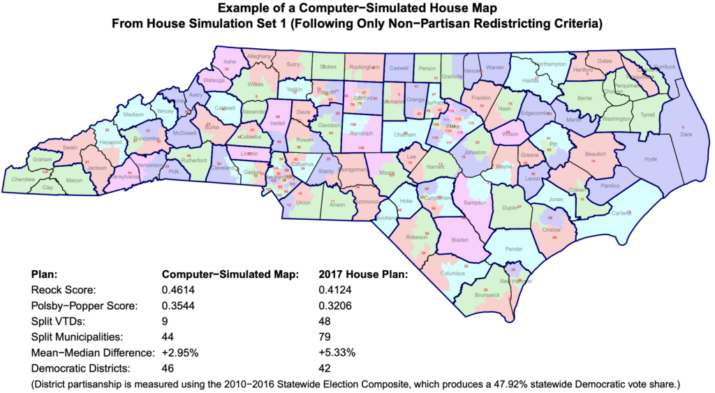
Jowei Chen developed a new way to analyze legislative districts and determine whether they have been unfairly gerrymandered for partisan reasons. Chen, an Associate Professor of Political Science and a Research Associate at the Center for Political Studies, used computer simulations to produce thousands of non-partisan districting plans that follow traditional districting criteria.
These simulated district maps formed the basis of Chen’s recent expert court testimony in Common Cause v. Lewis, a case in which plaintiffs argued that North Carolina state legislative district maps drawn in 2017 were unconstitutionally gerrymandered. By comparing the non-partisan simulated maps to the existing districts, Chen was able to show that the 2017 districts “cannot be explained by North Carolina’s political geography.”
The simulated maps ignored all partisan and racial considerations. North Carolina’s General Assembly adopted several traditional districting criteria for drawing districts, and Chen’s simulations followed only these neutral criteria, including: equalizing population, maximizing geographic compactness, and preserving political subdivisions such as county, municipal, and precinct boundaries. By holding constant all of these traditional redistricting criteria, Chen determined that the 2017 district maps could not be explained by factors other than the intentional pursuit of partisan advantage.
Specifically, when compared to the simulated maps, Chen found that the 2017 districts split far more precincts and municipalities than was reasonably necessary, and were significantly less geographically compact than the simulations.
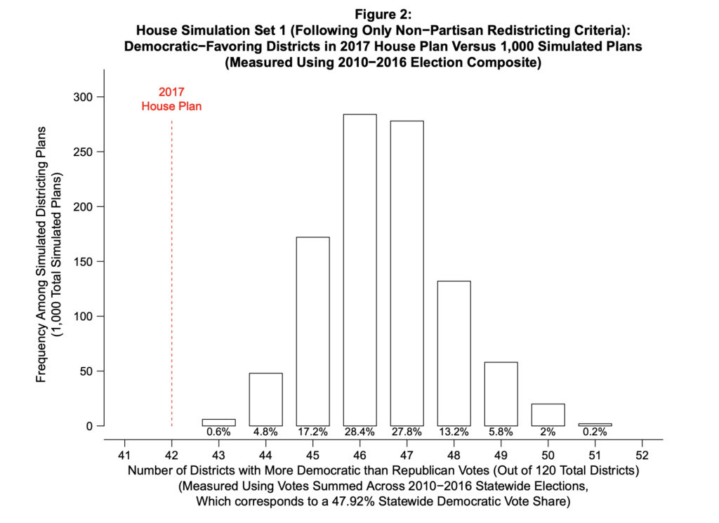
By disregarding these traditional standards, the 2017 House Plan was able to create 78 Republican-leaning districts out of 120 total; the Senate Plan created 32 Republican-leaning districts out of 50.
Using data from 10 recent elections in North Carolina, Chen compared the partisan leanings of the simulated districts to the actual ones. Every one of the simulated maps based on traditional criteria created fewer Republican-leaning districts. In fact, the 2017 House and Senate plans were extreme statistical outliers, demonstrating that partisanship predominated over the traditional criteria in those plans.
Determining whether legislative maps are fair will be an ongoing process involving courts and voters across different states. But in recent years, the simulation techniques developed by Chen have been repeatedly cited and relied upon by state and federal courts in Pennsylvania, Michigan, and elsewhere as a more scientific method for measuring how much districting maps are gerrymandered for partisan gain.
Since the 2016 presidential campaign anti-immigration policies have been very popular among President Trump’s strongest supporters, though they do not present obvious benefits to the economy or national security. Strategists suppose that the intent of the anti-immigration rhetoric and policies is to energize the president’s base.
But what about people who identify with the targets of these policies, specifically Latinos? Are they mobilized against anti-immigration proposals, or are they further deterred from political participation?
New research by Nicholas A. Valentino, Ali Valenzuela, and Omar Wasow finds that anger was associated with higher voter turnout among Latinos, but the Latinos who expressed more fear had lower voting rates.
The role of emotions in politics is complex. The research team begins with the observation that negative emotions do not always have negative consequences for politics. Indeed, negative emotions may promote attention and interest, and drive people to vote. They draw a distinction between different negative emotions: while anger may spur political action, fear can suppress it.
The research team fielded a nationally-representative panel survey of white and Latino registered voters before and after the 2018 midterm elections. Respondents were asked about their experience with Immigration and Customs Enforcement (ICE) officials and their exposure to campaign ads focused on immigration. Participants were also asked to rate their emotional reactions to the current direction of the country.
The results showed that Latinos interacted with ICE more frequently than whites did, but both groups had the same level of exposure to campaign ads. Latinos reported more anger than whites, and also more fear. In fact, among the negative emotions in the survey, fear among Latinos was highest.
In the sample the validated voting rate among Latinos was 39%; among whites in the sample it was 72%, demonstrating the under-mobilization of Latino voters. Whether Latinos vote in greater numbers in 2020 may depend on whether they are mobilized by anger against anti-immigration rhetoric, or whether they are deterred by fear stemming from policies like ICE detention and deportation.
We’re immersed in a media landscape full of choices. News, information, and entertainment are all at our fingertips. But does this mean that people are better informed about important issues? Is it is possible for people who aren’t interested in seeking out political news to learn about candidates and issues through the information they’re exposed to casually? Brian Weeks, Daniel S. Lane, Lauren B. Potts, and Nojin Kwak conducted two surveys to answer this question.
Motivation and opportunity play a big role in the amount of news we’re exposed to. People who are deeply interested in politics are motivated to seek out information, and as a result, they are better informed about candidates and policies.
The nature of the media environment makes it hard to avoid news and political information; many people consume news without trying. As we have more access to all types of media, we are incidentally exposed to political information. Does increased accidental exposure make up for a lack of motivation to seek out news, or does all of that information rush past us without making us more knowledgeable?
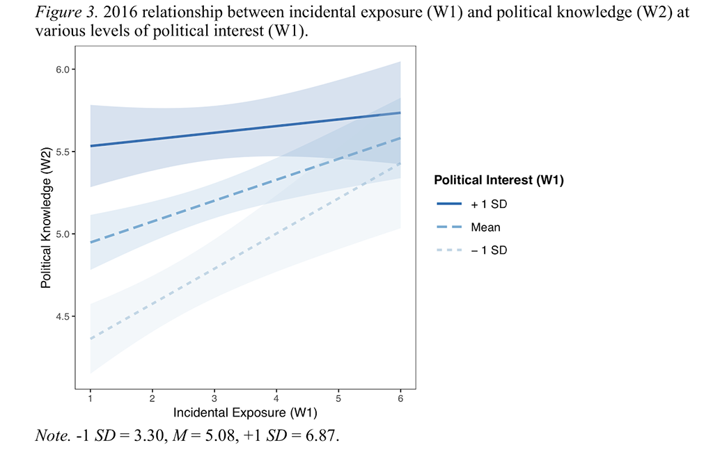
To test whether this incidental exposure to news translates into an increase in political knowledge, Weeks and his co-authors conducted a series of surveys. They collected panel survey data two waves during the 2012 presidential election and conducted another two waves of surveys during the 2016 presidential election. The surveys asked participants about whether they were exposed to political information they didn’t seek out, their level of political interest, and measured their knowledge of candidates’ policy positions.
The surveys showed strong evidence that people who had incidental exposure to news about presidential candidates knew more about the candidates’ policy positions.
The biggest benefit of incidental exposure was seen in the group of people who rated themselves least politically interested, which suggests that greater exposure can make up for a lack of motivation to seek out news.
Knowledge of candidates and their policy positions is still essential for well-informed citizens, and the growth of opportunities to be exposed to news from many sources may reduce gaps in knowledge.