Dec 4, 2014 | ANES, Elections, Innovative Methodology, National
Post developed by Katie Brown and Shanto Iyengar.
The inaugural Michigan Political Communication Workshop welcomed renowned political science and communication scholar Shanto Iyengar from Stanford University. Iyengar presented a talk entitled “Fear and Loathing across Party Lines.”
Iyengar began by considering the current polarized state of American politics. Both parties moving toward ideological poles has resulted in policy gridlock (see: government shutdown, debt ceiling negotiations). But does this polarization extend to the public in general? To answer this question, Iyengar measured individual resentment with both explicit and implicit measures.
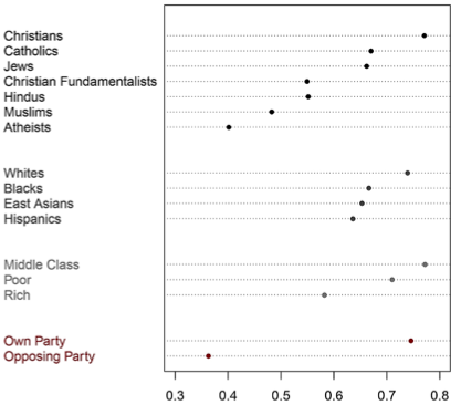
2008 ANES: Party vs Other Divisions
For an explicit measure, Iyengar turned to survey evidence. The American National Election Studies (ANES) indeed illustrates a significant decline in ratings of the other party based on feeling thermometer questions. Likewise, social distance between parties has increased over time, as measured by stereotypes of party supporters and marriage across party lines. In fact, this out-group animosity marks a deeper divide than other considerations, even race (see graph below).
But these surveys gauge animosity at the conscious level. Iyengar also believes mental operations concerning out-party evaluations occur outside of conscious awareness. So, along with Sean J. Westwood, Iyengar pioneered implicit measures of out-party animosity. Specifically, Iyengar and Westwood adapted the Implicit Association Test— originally used to capture racism – to political parties. Interestingly, the IAT also captured this animosity, although the polarization was more pronounced with the explicit survey measures. The chart on the left shows the starker divide between Democrats and Republicans using the feeling thermometer; the chart on the right shows the difference with the IAT.
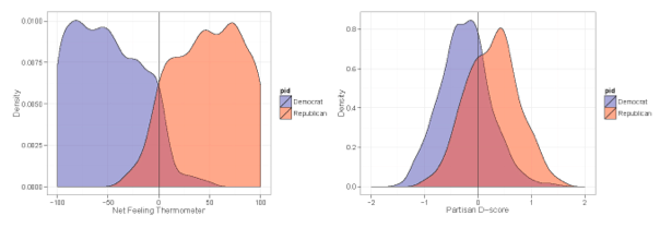
Comparing Implicit with Explicit Affect
Iyengar also adapted classic economic games to test implicit out-party animosity. Both games allow the participant to share a proportion of money provided by the researchers. Interestingly, participants gave less to out-party opponents. Iyengar cites this as evidence of implicit out-party bias.
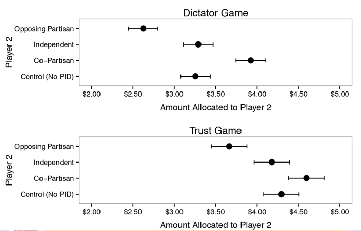
Economic Game Results by Party
Together, these results suggest marked party polarization. The hostility is so strong that politicians running on a bipartisan platform are likely to be out of step with public opinion.
Nov 10, 2014 | Innovative Methodology, International, Law
Post developed by Katie Brown and Ugo Troiano.
In Italy, would be tax evaders hide money in houses. In response, the Italian government developed a “Ghost Buildings” program which used technology to identify and monitor buildings otherwise hidden from tax authorities. In total, the Italian government identified two million houses that were hidden for tax purposes.
How do voters respond to anti-tax evasion policy? Answering this question has been a challenge because tax evasion is illegal and is typically very hard to measure. However, the Ghost Buildings program offers a unique opportunity to investigate the issue. Center for Political Studies (CPS) Faculty Associate and Department of Economics Assistant Professor Ugo Troiano seized this chance in a working paper along with his co-author Lorenzo Casaburi who is a Postdoctoral Fellow at the Stanford Institute for Economic Policy Research (SIEPR).
The authors approached the research knowing that anti-tax evasion programs like the Ghost Building program hurt tax evaders while benefiting tax payers. Usually, one assumes evaders to be the minority and payers to be the majority. If this is the case, a program like Italy’s Ghost Buildings one should boost public opinion in support of incumbents as payers support the crackdown on evaders.
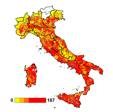
To test the effect in Italy, the authors mapped the identified Ghost Buildings to calculate a town-by-town concentration, as illustrated by the graph below.
Ghost Building Concentration
The authors also collected geographic and socio-economic data for the same towns. They found tax evasion to be more prevalent in cities, possibly because cities offer more opportunity to to buy houses from a larger stock. Tax evasion was also found to have an inverse relationship with social capital and income.
Troiano and Casaburi then looked at the impact of the Ghost Buildings program on vote choice. Specifically, they were interested in change in support for incumbent politicians. The graph below displays the results:
Difference in Reelection Rates Pre- to Post- Ghost Buildings Program
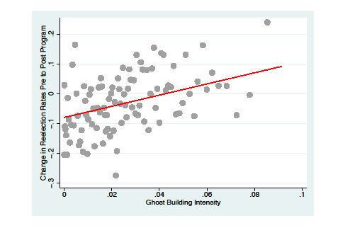
The positive trend-line shows that the higher the proportion of Ghost Buildings in a given town, the more that vote support for the incumbent increases. The authors therefore concluded that, “Local incumbents are shown to obtain positive political returns, namely, an increase in their reelection likelihood, from the Ghost Building program.”
The authors found that fighting tax evasion allowed politicians to increase public good provision, thereby creating material benefits to society. Second, support for the incumbent who fights tax evasion was found to be stronger in regions with attitudes more hostile to evaders. The authors also looked at responses to the World Values Survey question “Do you think tax evasion is justifiable?” and what they found suggests that tax enforcement and attitudes toward evasion have a complementary relationship.
Nov 3, 2014 | Elections, Innovative Methodology, National
Post developed by Katie Brown and Kristyn L. Karl.
It’s election time again. And elections bring advertising assaults by Internet, radio, and TV. In Michigan and Iowa, there is one political TV ad every two minutes. But what effect does this have on potential voters?
Center for Political Studies (CPS) affiliate and Ph.D. Candidate in Political Science at the University of Michigan Kristyn L. Karl investigated this question. Where previous research in this area uses self-reported measures of emotional response, Karl tackled the issue with a randomized experiment capturing a direct measure of physiological arousal – skin conductance. She was interested in the impact of emotional arousal from political ads on citizens’ intention to participate in politics.
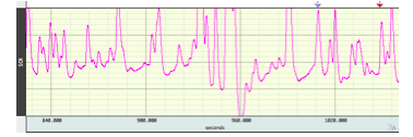
Sample Skin Conductance Output
For the study, Karl brought participants into the lab and measured their skin conductance while watching a political advertisement. The ad was fictitious and created in a way that gave Karl control over the message, images, music, and structure. Karl designed four ads: a positive Democratic or Republican ad, and attack ads on Democrats or Republicans. Participants randomly watched one of the four ads while their physiological arousal was captured; after the ad, they reported their current emotions and their willingness to participate with regard to 1) signing a petition, 2) initiating a conversation on a political topic, and 3) attending a meeting, rally, or demonstration.
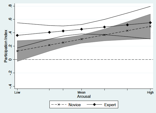
Karl finds some key differences between political novices and more experienced participants. For political novices, both physiological arousal and self-reported negative emotion positively predicted participation in politics. Among political experts, however, the connection between arousal, self-reported emotion, and intended participation is more muted. Specifically, while the trend is still positive, the effect fails to reach statistical significance.
The Marginal Effect of Physiological Arousal on Political Participation by Political Sophistication
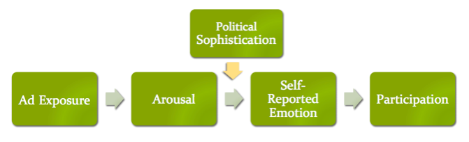
Karl turns to theory to explain the limited effect of arousal on intention to participate among experts. Experts have a well-developed cognitive network about politics which, for better or worse, allows them to more easily interpret and condition their emotional responses to political stimuli. Political novices do not have this expansive network and so react in a more instinctual way. The model below captures this:
This experiment highlights the importance of using alternative measures of emotional arousal as a complementary tool to self-reported measures. Moreover, it draws attention to the question of for whom political ads are motivating and how do they work.
Oct 28, 2014 | Foreign Affairs, Innovative Methodology, International
Post developed by Katie Brown in coordination with Khalil Shikaki.
Can measurement promote democratization in the Arab world? Khalil Shikaki, visiting scholar at the Center for Political Studies (CPS), believes the answer is “yes.” In 2006, he set out to create an instrument to measure both the direction and sustainability of the transitional process. The resulting Arab Democracy Index is a joint project between the Palestinian Center for Policy and Survey Research (PCPSR), the Arab Reform Initiative, and the Arab Barometer.
The Arab Democracy Index is unique in that it comes from within the Arab world to reflect local experiences. It also pulls from three main sources: data on government actions, reviews of legal and constitutional text, and public opinion data. Local teams in nine to twelve countries collect this data, tailoring the standardized process based on their local expertise. Together, these sources offer insight into 40 indicators of democracy.
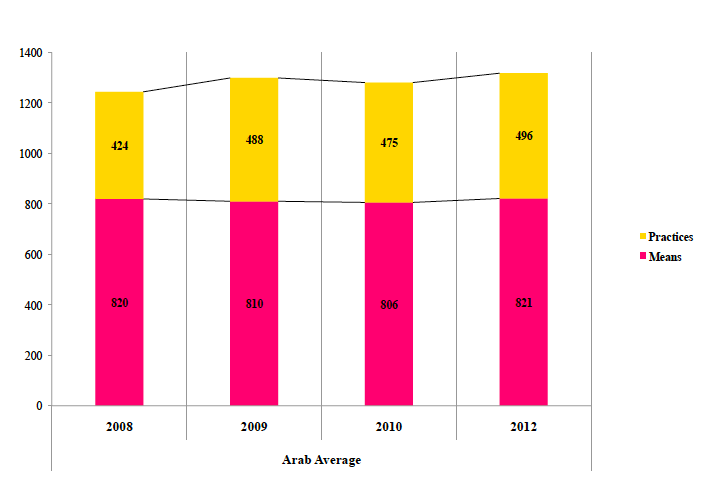
The Arab Democracy Index indicators break down into two types. First, there are Means, e.g., legislation, which speak to democracy de jure. Second, there are Practices, e.g., elections, which speak to democracy de facto. Data in each category tally to a total. Scores below 400 constitute an undemocratic state, 400 to 699 indicate early signs of transition, 700 to 1,000 highlight visible progress toward democracy, and scores above 1,000 pertain to already democratic nations. The graph below displays the results for all Arab countries. Overall, Means remain relatively constant while Practices show signs of improvement.
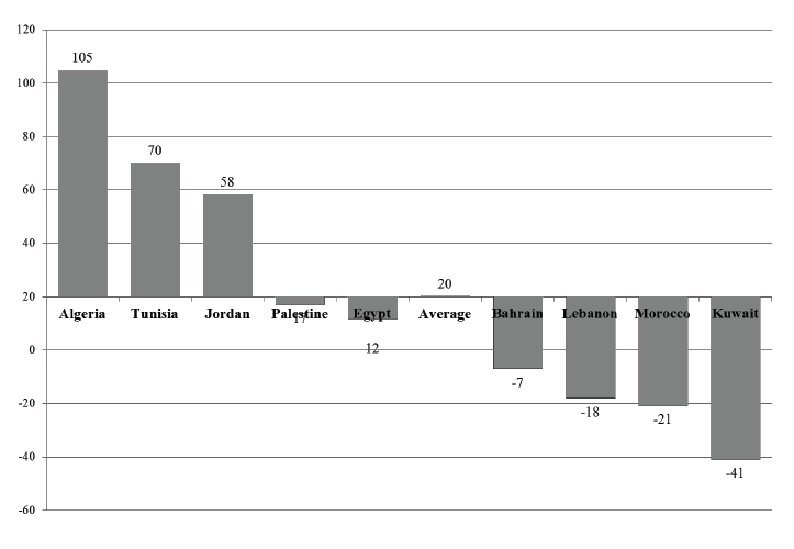
The data can also be broken down by country, as in the graph below. As we can see, some nations are driving this positive trend while others are moving away from democracy during this period.
The results led to reports, issued in 2008, 2009, and 2010, that not only document opinion but offer policy recommendations for policy change tailored to each country. Shikaki notes that while political and civil rights have improved, more must be done. Specifically, he recommends a focus on reforming education, social justice, and socio-economic reforms. The Arab Democracy Index also underscores an important larger point: external pressure from the U.S. Department of State can help change democracy in theory, but change in practice must come from within.
Oct 21, 2014 | Conflict, Innovative Methodology, International
Post developed by Katie Brown and Christian Davenport.
 Who did what to whom in 1994 Rwanda? This is the central question driving the GenoDynamics project directed by Center for Political Studies Faculty Associate and Professor of Political Science, Christian Davenport, and former CPS affiliate and current Dean of the Frank Batten School of Leadership and Public Policy at the University of Virginia, Allan Stam.
Last week, Davenport updated the associated website to provide new, unreleased data that the project collected, documents that can no longer be found on the topic, and new visualizations and animations of collected data.
Also added to the website was a page specifically dedicated to a recent BBC documentary, Rwanda’s Untold Story, that features the research. The documentary premiered on October 1, 2014 in Europe and is now available for viewing on the Internet. The film itself has prompted some controversy. The most vocal critics call those involved with the documentary “genocide deniers,” which by Rwanda law classifies as anyone who completely denies or seeks to “trivialize” or reduce the number of Tutsi victims declared by the government. Others have protested outside the BBC headquarters in London. Still others have praised the film for bringing forward a story that they felt was long overdue.
The GenoDynamics website features all of this criticism. But it also offers a glimpse into what the researchers found and how they found it.
Davenport and Stam knew that Rwanda 1994 was a time of wide-spread violence when they began investigating in depth in 2000. But they did not know “who was engaged in what activity at what time and at what place.” With funding from the National Science Foundation (NSF), the researchers content analyzed and compiled data from the Rwandan government, the International Criminal Tribunal on Rwanda (ICTR), Human Rights Watch, African Rights, and Ibuka. These sources were used to create a Bayes estimation of the number of people killed in each commune of the country for the 100 days of the genocide, civil war, reprisal killings and random violence. Davenport and Stam interviewed victims and survivors as well as perpetrators in Rwanda, and they surveyed citizens in the town of Butare. Finally, through a triangulation of information from the Central Intelligence Agency (CIA), a Canadian Military Satellite image, and Hutu and Tutsi military informants through the ICTR, they created variables concerning troop movement and zone of control. This allowed them to see who was responsible for killings in the different locations.
The work is controversial in many respects – including the degree of transparency involved, as Davenport and Stam are the only project that has made all relevant data publicly available – but the biggest controversy concerns how they challenge popular understanding. At present, the official story is that one million people were killed by the extremist Hutu government and the militias associated with them, with most of (and in some stories all of) the victims being Tutsi (upwards of 800,000 in some estimations). But Davenport and Stam found that in 1991 (according to the Rwandan census as well as from population projections back from the 1950s) only 500,000 Tutsis lived in Rwanda. Davenport and Stam further concluded that approximately 200,000 Tutsis were killed, as it was reported by a survivors organization that 300,000 Tutsi survived. While this number is less than the official number, it still represents the partial annihilation of the Tutsi population, which includes genocide but likely other crimes against humanity and human rights violations as well. But the estimation also changes the official story: the results of this research suggest that the majority of those killed in 1994 were in fact Hutu.
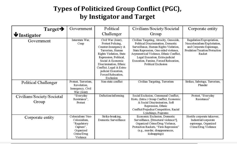
After 14 years of research, Davenport and Stam believe that there were several types of political violence occurring in Rwanda in 1994. The table below summarizes the different types of violence that were potentially involved (by perpetrator and victim). The larger project is trying to sort Rwandan political violence into each cell, which is incredibly difficult but useful for understanding exactly what happened.
The current controversy is not a new one. When Davenport and Stam presented their findings to the Rwandan government, they were told that they would not be welcome to return. When they presented their findings at the 10th and 15th anniversaries, they received more criticism. At no point was any new evidence or data provided which countered their narrative. In addition to the documentary, Davenport and Stam are working on a peer reviewed journal article and a book for a broader audience.
Oct 7, 2014 | Innovative Methodology, International, Social Policy
Post developed by Katie Brown and Ugo Troiano.

Photo credit: ThinkStock
Around the globe, the average maternity leave is 118 days, but with a lot of variation. Maternity leave periods range from 45 days in Bahrain and the United Arab Emirates to 480 days in Sweden. Why the difference? And, moreover, does the variation relate to gender discrimination?
Assistant Professor of Economics and Center for Political Studies (CPS) faculty associate Ugo Troiano, along with Yehonatan Givati of The Hebrew University of Jerusalem Law School, investigated these questions and published their results in an article in The Journal of Law and Economics.
Their core theory is simple: maternity leave is costly to employers, so when the government mandates long periods of maternity leave, women may be discriminated against and receive lower wages as a result. However, places with a low tolerance for pay gaps won’t let that happen, and the incidence of this policy ends up being shared across genders. As a consequence, it becomes more economically “optimal” to enact longer mandatory maternity leaves in societies that are not discriminatory toward women. This theory is consistent with the empirical evidence.
The authors show that maternity leave is indeed shorter in societies where survey respondents think that men should receive preferential treatment in the workplace. The authors measure this attitude through a World Values Study question that asks level of agreement with, “When jobs are scarce, men should have more right to a job than women.” Aggregated to the national level and combined with data on the length of maternity leaves, they find the two are related.
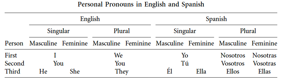
However, that evidence alone does not allow us to conclude that culture is causing a longer leave, because it’s possible that causation goes in the opposite direction: a longer leave is causing more tolerant attitudes toward women. In order to alleviate this concern, Givati and Troiano looked at a proxy from attitudes less likely to change because of maternity leave: language. Specifically, they developed a measure from recent research in psychology and linguistics known as linguistic relativity suggesting that language shapes thought. Following from this, they analyzed the number of gender-differentiated pronouns across languages to see if this corresponded to tolerance of gender discrimination. For example, English uses one gender-differentiated pronoun associated with gender and the number of people referenced, while Spanish uses three (see the table below). In all, Troiano and Givati tallied the number of gender-differentiated pronouns in 33 languages using grammar books, and they looked to see whether the number of pronouns was negatively correlated with gender tolerant attitudes.
The authors indeed find a connection, with more gendered pronouns correlated with greater tolerance of gender discrimination as measured by the World Values Survey question. Next, the authors estimated a regression model, with length of maternity leave as the dependent variable and number of gendered pronouns as the independent variable. Troiano and Givati find that the more gendered pronouns, the shorter the maternity leave. Or, on the flip side, the fewer gendered pronouns, the longer the maternity leave.
Troiano concludes, “This project is an example of how concepts from different social sciences can be used to answer specific policy questions. To understand the factors that affect the variation of maternity leave across countries we integrated economic concepts (incidence of a policy), sociological ones (measuring attitudes from survey) and linguistic ones.”