Nov 29, 2016 | Elections, Michigan, National
Post written by Josh Pasek, Faculty Associate, Center for Political Studies and Assistant Professor of Communication Studies, University of Michigan.
If Rick Snyder weren’t the Governor of Michigan, Donald Trump would probably have 16 fewer electoral votes. I say this not because I think Governor Snyder did anything improper, but because Michigan law provides a small electoral benefit to the Governor’s party in all statewide elections; candidates from that party are listed first on the ballot.
Yesterday, Donald Trump was declared the winner in Michigan by a mere 10,704 votes, out of nearly 5 million presidential votes cast. Although this is not the smallest state margin in recent history – President Bush won Florida and the election by 537 votes and Al Franken won his senate seat in Minnesota by 225 (after the result flipped in a recount) – it represented a margin of 0.22%. The best estimate of the effect of being listed first on the ballot in a presidential election is an improvement of the first-listed individual’s vote share of 0.31%. Thus, we would expect Hillary Clinton to have won Michigan by 0.4% if she were listed first and about 0.09% if neither candidate were consistently listed in the first position.
It may seem surprising to suggest that anyone’s presidential vote would hinge on the order of candidates’ names, but the evidence is strong. In a paper I published with colleagues in Public Opinion Quarterly in 2014, we looked at name order effects across 76 contests in California – one of the few states that rotates the order of candidates on the ballot – to estimate the size of this benefit. We later replicated the results in a study of North Dakota. Both times, we found that first-listed candidates received a benefit and that the effect was present, though smaller, at the presidential level.
There are many reasons that voters might choose the first name, even if they started their ballots without a predetermined presidential candidate. Some individuals might have been truly ambivalent and selected the first name they had heard of (in this case, “Trump”), others may have instead checked the first straight party box – listed in a similar order – without intending to select our new President-elect. Regardless of the cognitive mechanisms involved, the end result is clear – the “will” of the voters can be diverted by seemingly innocuous features of ballot design.
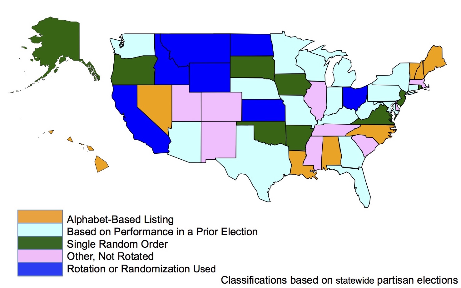
How broadly is this first-position benefit a problem? Across the country, only seven states vary the order of candidate names across precincts. Another nine choose a single random order for listing candidates in each contest, but use that same order across the entire state. And the rest generally use some combination of alphabetic ordering or a listing based on who won in prior elections at the state level. Michigan’s system – prioritizing the candidate who last won the Governor’s office – is among the most common methods.
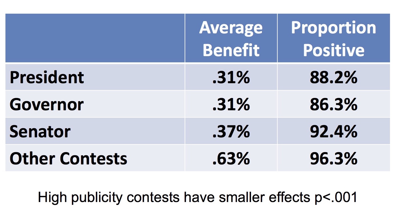
Given the control that Republicans currently hold over governorships, this bias likely helps Republicans maintain their dominance over many state legislatures. And the effects of being listed first only grow as you move down the ballot. In our study of California, we found the average benefit for a Governor was also 0.31 percent*, Senators gained 0.37 percentage points of additional votes, and candidates for other statewide offices gained an average of 0.63 percentage points.
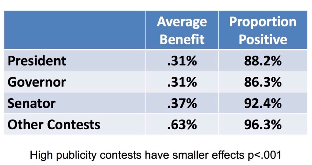
Source: Prevalence and moderators of the candidate name-order effect evidence from statewide general elections in California Pasek J., Schneider D., Krosnick J.A., Tahk A., Ophir E., Milligan C. (2014) Public Opinion Quarterly, 78 (2) , pp. 416-439.
For a better answer, we might look to the strategy adopted by Michigan’s neighbor to the South. Ohio produces a unique ballot for each precinct where the ordering of candidates’ names is rotated. Although it is too late to prevent this effect from altering the 2016 election, it may have less of an impact if everyone were not filling out ballots with the same candidates listed first.
*this would likely be larger if California did not elect its Governors in non-presidential years.
Jan 29, 2015 | Current Events, National
Post developed by Katie Brown and Cassandra Grafström.
 So-called “inflation truthers” have made recent news waves with claims that inflation is actually much higher than reported. Mainstream financial news organizations have debunked the inflation truthers charges with the simple math of averages. But what if the truthers are just looking in the wrong place? That is, is there systematic bias not in reported inflation but projected inflation?
Enter the work of Cassandra Grafström, a Ph.D. candidate in the Department of Political Science and affiliate of the Center for Political Studies (CPS) at the University of Michigan. Grafström, along with Christopher Gandrud of the Hertie School of Governance, conducted research to trace potential partisan biases of inflation estimates.
Grafström and Gandrud began with the widely accepted notion that under more liberal governments, the United States Federal Reserve tends to predict higher inflation. But why? Democratic administrations tend to try to lower unemployment, which causes higher inflation. Under more conservative governments, on the other hand, the Federal Reserve predicts lower inflation. Yet there exists little empirical support for these ideas. Instead, most work on inflation comes from the field of economics, with a focus on comparing Federal predictions with money market predictions.
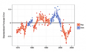
To test these commonly held ideas, Grafström and Gandrud looked at the Federal Reserve’s predictions across time. The authors took Presidential party and actual monetary and fiscal policies into account. They found that, regardless of actual monetary and fiscal policies, under more liberal presidents, the Federal Reserve over-estimates inflation while under more conservative presidents, the Federal Reserve under-estimates inflation.
In the graph below, perfect predictions would create an error of 0. Points above the line correspond to over-estimation and points below the line correspond to under-estimation. As we can see, when a Democrat is president, estimate errors tend to be above the line, while the average of Republican errors falls below the line.
Errors in Inflation Forecasts Across Time by Presidential Party
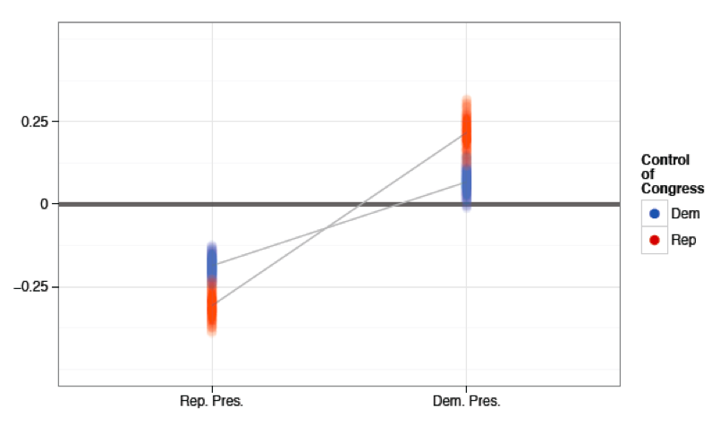
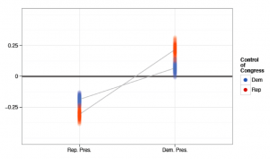
Grafström and Gandrud also wondered if control of Congress plays a role. To test this, they considered the joint influence of presidential party and the majority party in Congress. As the graph below shows, presidential party drives the trend. Interestingly, a Republican controlled Congress makes the original results stronger. That is, with a Democratic president and Republican congress, there is greater over-estimation of inflation. Likewise, with a Republican president and Republican congress, there is greater under-estimation of inflation. The graph below illustrates these findings (0 would again represent a match between predicted and actual inflation)
Errors in Inflation Forecasts Across Time by Presidential and Congress Majority Parties
Given the clear links between presidential partisanship and inflation forecasts, the authors worry that this likely translates into biased monetary and fiscal policies. That is, over-estimated inflation under Democratic presidents may lead to more restrictive monetary and fiscal policies. On the other hand, under-estimated inflation under Republican presidents may lead to more expansive monetary and fiscal policies. In both cases, the policy changes would be based on forecasts biased by flawed but accepted rules of thumb about inflation under Democrat vs. Republican presidents.
Jan 22, 2015 | Innovative Methodology, National
Post developed by Katie Brown and Josh Pasek.

Photo credit: ThinkStock
Have you noticed how the products you look at online seem to follow you from site to site and the coupons you receive in the mail sometimes seem a little too targeted? This happens because a set of companies are gathering information about Americans and merging them together into vast marketing databases. In addition to creating awkwardly personal advertisements, these data might be useful for researchers who want to know about the kinds of people who are and are not responding to public opinion surveys.
But before marketing data are incorporated into social science analyses, it is important to know how accurate the information actually is. Indeed, there are many concerns about consumer data. It could be out of date, incomplete, linked to the wrong person, or simply false for a variety of reasons. If we don’t know when marketing data are accurate, it is going to be difficult to figure out how these data can be used.
This is where the work of Josh Pasek, Center for Political Studies (CPS) Faculty Associate and Assistant Professor of Communication, comes in. Pasek, along with S. Mo Jang, Curtiss L. Cobb, J. Michael Dennis, and Charles DiSogra, have a forthcoming paper in Public Opinion Quarterly about the utility of marketing data. With Gfk Custom Research, 25,000 random addresses were selected, with about 10% of those joining the study. The marketing data available on these individuals was then matched against data collected as part of the study.
Interestingly, many variables showed large discrepancies between the two sources. Incomes mismatched by more than $10,000 for 43% of participants, while education level differed in at least two measures for 25%. Even the number of people living at the address differed by two or more in 35% of cases. Pasek and colleagues also investigate missing data with three different analyses. Ultimately, they find that the amount of data missing from consumer data is vast.
But at the same time, the consumer data performed better than chance in predicting actual data for all variables. This may make them useful for marketing purposes, but Pasek cautions that social scientific applications could be problematic. As Pasek says, “The bottom line is that these data are not consistently accurate. Although they may be great for targeting people who are more likely to buy a particular brand of shoes, our results suggest that marketing databases don’t have the precision for many research purposes.”
Dec 11, 2014 | ANES, ANES 65th Anniversary, National
Post developed by Katie Brown.
This post is part of a series celebrating the 65th anniversary of the American National Election Studies (ANES). The posts will seek to highlight some of the many ways in which the ANES has benefited scholarship, the public, and the advancement of science.
University of Michigan political scientists Angus Campbell, Philip E. Converse, Warren E. Miller, and Donald E. Stokes published The American Voter in 1960. The American Voter takes root in a time of changing notions about individuals and decision-making. In the 1940s, Paul Lazarsfeld and the Columbia school placed a new emphasis on demographic factors in responses to media and support for President Franklin D. Roosevelt.
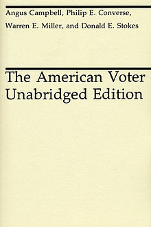 In The American Voter, Campbell, Converse, Miller, and Stokes became part of this behavioral revolution as they considered audience traits in the context of politics. The main argument of the book holds that most American voters cast their ballots on the basis of party identification. Specifically, voter decisions pass through a funnel. At the opening of the funnel is party identification. With this lens, voters process issue agenda. They then narrow down to evaluate candidate traits. Finally, at the small end of the funnel is vote choice. This understanding of voters encompasses the “Michigan Model.”
In time, the Michigan Model was revised. The original Michigan Model held party identification as king. This thesis maps onto the strong post-World War II Democratic party, strengthened by Roosevelt. In the next few decades, party identification weakened. More recently, party identification reemerged stronger than ever due to a variety of factors, including changing campaign strategy and polarization.
So while these new generations of scholars find different balances between party identification and other factors influencing vote choice, The American Voter provided a bar against which this change could be measured.
The American Voter also enabled the tools of measurement with ANES. The American Voter utilized early waves of what would become the American National Election Studies (ANES), which Miller himself facilitated. The ANES developed into a multi-wave, decade-spanning project offering continuous data on the American electorate since 1948.
Cited over 6,500 times to date, the book remains a seminal text in political science.
Dec 4, 2014 | ANES, Elections, Innovative Methodology, National
Post developed by Katie Brown and Shanto Iyengar.
The inaugural Michigan Political Communication Workshop welcomed renowned political science and communication scholar Shanto Iyengar from Stanford University. Iyengar presented a talk entitled “Fear and Loathing across Party Lines.”
Iyengar began by considering the current polarized state of American politics. Both parties moving toward ideological poles has resulted in policy gridlock (see: government shutdown, debt ceiling negotiations). But does this polarization extend to the public in general? To answer this question, Iyengar measured individual resentment with both explicit and implicit measures.
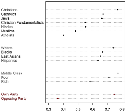
2008 ANES: Party vs Other Divisions
For an explicit measure, Iyengar turned to survey evidence. The American National Election Studies (ANES) indeed illustrates a significant decline in ratings of the other party based on feeling thermometer questions. Likewise, social distance between parties has increased over time, as measured by stereotypes of party supporters and marriage across party lines. In fact, this out-group animosity marks a deeper divide than other considerations, even race (see graph below).
But these surveys gauge animosity at the conscious level. Iyengar also believes mental operations concerning out-party evaluations occur outside of conscious awareness. So, along with Sean J. Westwood, Iyengar pioneered implicit measures of out-party animosity. Specifically, Iyengar and Westwood adapted the Implicit Association Test— originally used to capture racism – to political parties. Interestingly, the IAT also captured this animosity, although the polarization was more pronounced with the explicit survey measures. The chart on the left shows the starker divide between Democrats and Republicans using the feeling thermometer; the chart on the right shows the difference with the IAT.
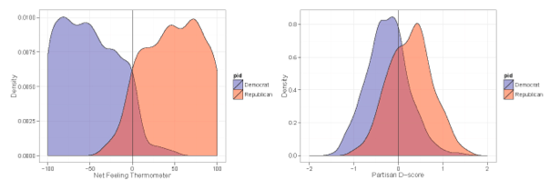
Comparing Implicit with Explicit Affect
Iyengar also adapted classic economic games to test implicit out-party animosity. Both games allow the participant to share a proportion of money provided by the researchers. Interestingly, participants gave less to out-party opponents. Iyengar cites this as evidence of implicit out-party bias.
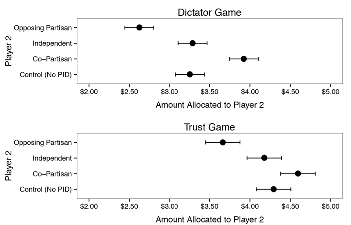
Economic Game Results by Party
Together, these results suggest marked party polarization. The hostility is so strong that politicians running on a bipartisan platform are likely to be out of step with public opinion.
Nov 3, 2014 | Elections, Innovative Methodology, National
Post developed by Katie Brown and Kristyn L. Karl.
It’s election time again. And elections bring advertising assaults by Internet, radio, and TV. In Michigan and Iowa, there is one political TV ad every two minutes. But what effect does this have on potential voters?
Center for Political Studies (CPS) affiliate and Ph.D. Candidate in Political Science at the University of Michigan Kristyn L. Karl investigated this question. Where previous research in this area uses self-reported measures of emotional response, Karl tackled the issue with a randomized experiment capturing a direct measure of physiological arousal – skin conductance. She was interested in the impact of emotional arousal from political ads on citizens’ intention to participate in politics.
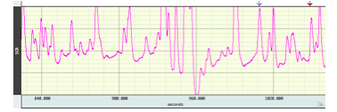
Sample Skin Conductance Output
For the study, Karl brought participants into the lab and measured their skin conductance while watching a political advertisement. The ad was fictitious and created in a way that gave Karl control over the message, images, music, and structure. Karl designed four ads: a positive Democratic or Republican ad, and attack ads on Democrats or Republicans. Participants randomly watched one of the four ads while their physiological arousal was captured; after the ad, they reported their current emotions and their willingness to participate with regard to 1) signing a petition, 2) initiating a conversation on a political topic, and 3) attending a meeting, rally, or demonstration.
Karl finds some key differences between political novices and more experienced participants. For political novices, both physiological arousal and self-reported negative emotion positively predicted participation in politics. Among political experts, however, the connection between arousal, self-reported emotion, and intended participation is more muted. Specifically, while the trend is still positive, the effect fails to reach statistical significance.
The Marginal Effect of Physiological Arousal on Political Participation by Political Sophistication
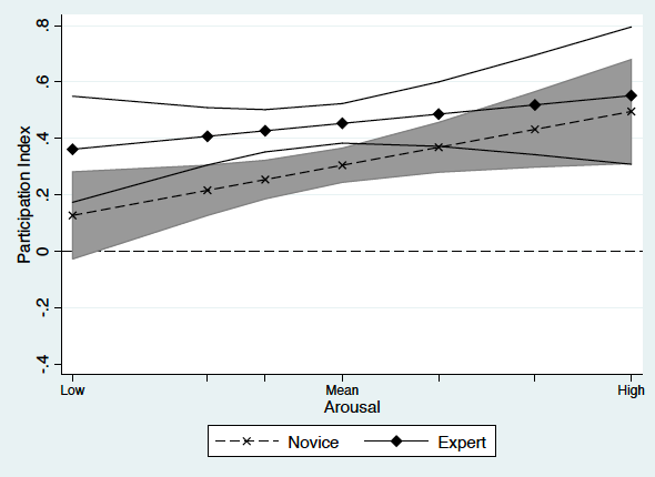
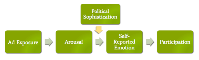
Karl turns to theory to explain the limited effect of arousal on intention to participate among experts. Experts have a well-developed cognitive network about politics which, for better or worse, allows them to more easily interpret and condition their emotional responses to political stimuli. Political novices do not have this expansive network and so react in a more instinctual way. The model below captures this:
This experiment highlights the importance of using alternative measures of emotional arousal as a complementary tool to self-reported measures. Moreover, it draws attention to the question of for whom political ads are motivating and how do they work.